A biochemical laboratory dedicated to prevention and treatment, with a strong focus on accuracy, reliability, and speed. They combine modern technology with the highest standards of quality to deliver trustworthy healthcare.
Service
Logo Design, Visual Identity
Year
2024
Brief
As a newcomer in the healthcare field, Vitalis Lab wanted to build immediate recognition and stand apart from the many established laboratories already competing for attention. They needed an identity that was modern and distinctive, one that could communicate professionalism without feeling cold or clinical. More importantly, they wanted people to feel reassured when choosing them, to see the brand and instinctively trust it.
The Challenge
Trust is the most valuable currency in healthcare, but it’s also the hardest to earn. Vitalis had no history, no reputation, and no base of loyal patients to rely on. Their challenge was to prove credibility visually and emotionally, to look as reliable as laboratories that had been in the market for decades. At the same time, they needed to avoid the sterile, impersonal image common in the industry and instead present themselves as precise and approachable.
Our Approach
How do you design trust for someone who hasn’t yet earned it? We studied competitors to understand what worked and where sameness diluted recognition. The approach was to keep everything clean, consistent, and confident, creating an identity that would grow with the brand rather than try to shout for attention on day one. The answer was in being clearer. We built a system that would feel stable and reliable. Every decision was guided by the idea that people look for comfort in the process. The identity was shaped to mirror the same sense of calm and reassurance patients feel when stepping into the lab itself, turning Vitalis into a place of trust.
Visual Identity
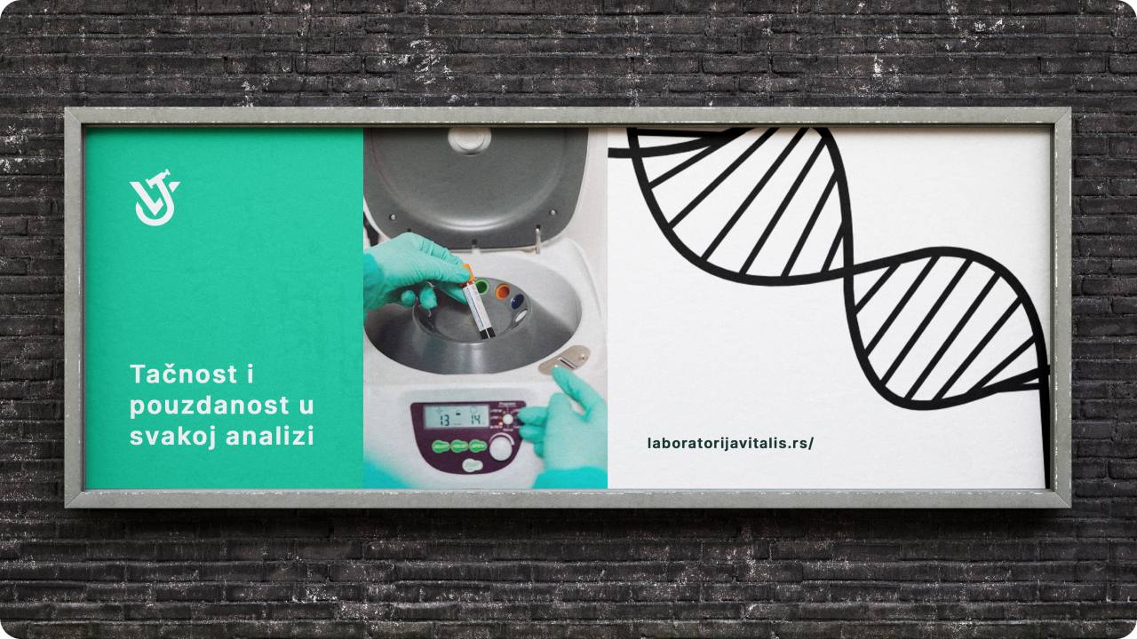
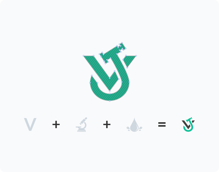
A green palette was chosen to signal freshness, balanced by white for precision and cleanliness. The logo design includes multiple layers of meaning. The initial “V,” a droplet symbolizing analysis, and subtle references to lab instruments. Typography emphasized clarity and readability, while supporting graphics hinted at structure and scientific precision without feeling overly technical. The system was designed with the importance to communicate one thing consistently: Vitalis is reliable.
Conclusion
The result was an identity that gave Vitalis a seat at the table from the very start. Patients saw them as professional and trustworthy, even without years of history to back them up. For us, the project was a reminder that design in healthcare needs a strong focus on reassurance and the little moments of calm that patients remember. It showed us that even in this field, design has the power to soften fear and create trust.