Frontrow logo
Back to Projects

Srednja Zemlja Publishing

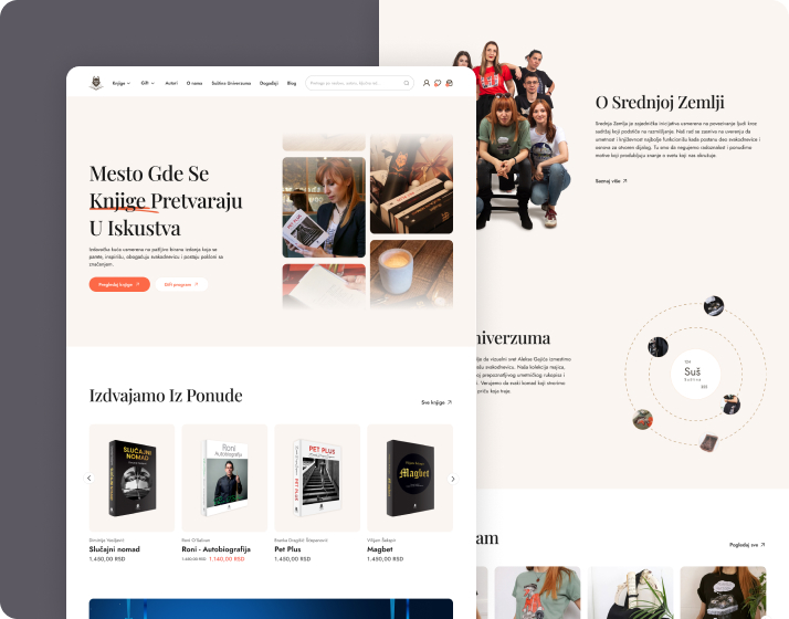
An independent Serbian publishing house dedicated to a carefully curated selection of literature, autobiographies and biographies, essayistic, and art editions. Focused on delivering intellectually enriching and beautifully produced titles, they have built a distinct presence in the regional cultural space for readers.

Srednja Zemlja Publishing
Service
Logo Design, Web Development
Industry
Publishing
Year
2026

Brief

The primary objective was establishing online shop from the ground up. While the previous website showcased products, it lacked the functionality to handle actual transactions or detailed product specifications. Beyond e-commerce, the brief called for a major UI overhaul to create a cleaner, more intuitive layout. To build deeper community engagement, we needed to introduce personalized user accounts allowing visitors to create favorite lists and manage their profiles seamlessly.

The Challenge

During the development phase due to technical limitations within WordPress, it was important to translate a highly custom, original user interface design into a platform environment required careful engineering. Standard templates could not support the distinct layout and user flow we envisioned. We had to push the boundaries of the platform to implement the design details without sacrificing site performance, responsive scaling and overall stability.
Srednja Zemlja Publishing

Our Approach

We focused heavily on UX design, prioritizing intuitive navigation that allows users to move effortlessly from product discovery to checkout. Instead of relying on generic layouts, we shaped a custom visual structure that helps the brand stand out in a crowded market. We structured the platform to feel welcoming and professional, ensuring that the integration of new features, like promotional banner areas and dynamic event listings, complemented the core shopping experience rather than cluttering it.

Conclusion

The redesign completely transformed how the client does business online. By upgrading the site from a passive brochure into an active e-commerce platform, sales began moving immediately. The brand now has a distinct visual identity that stands out, backed by features that did not exist before, including dedicated event spaces and promotional sections. The final result is a user-friendly, highly functional ecosystem that serves both the business goals and its community.

Explore Other
Projects

All Projects

Luča

Luča needed a symbol that would instantly feel rooted in Christianity and carry the meaning of light as…

Floxly

The idea behind Floxly was to design a complete digital presence that could convincingly sit in the SaaS…