Frontrow logo
Back to Projects

Nanaland decorations

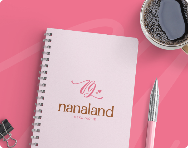
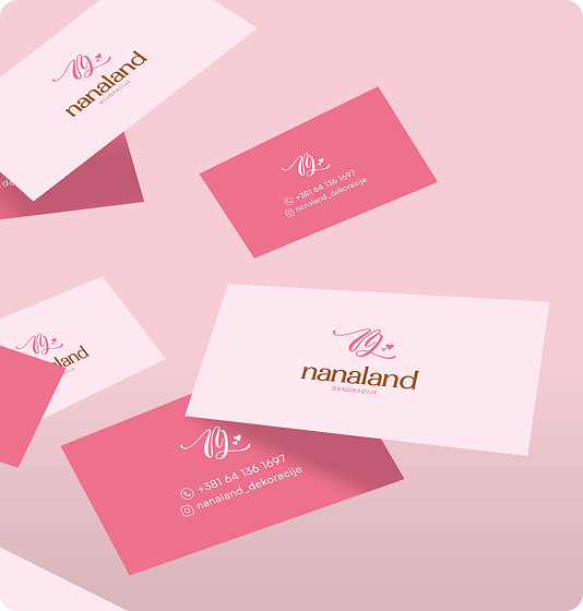
Celebrations are remembered through details, and those details are handmade sweets, sweet table that feels personal, and the care behind it all. NanaLand Decorations builds their entire business around those details, creating homemade decor and treats that carry warmth into every event.

Nanaland decorations
Service
UI/UX Design, Logo Design, Visual Identity
Industry
Event Services/Event Planning
Year
2025

Brief

NanaLand is a small business creating handmade sweets and party décor for celebrations. The vision was to craft an identity and digital presence that captured the warmth of homemade treats while also feeling professional enough to compete in a crowded event and catering market.

The Challenge

This small business began with a self-made identity, enough to get started with the small business. As the business expanded, the owner wanted to elevate her brand so it reflected the same precision and passion she poured into her craft. The biggest challenge was creating a professional identity that captured her dedication to quality and detail without making her look generic. It had to be personal and warm.
Nanaland decorations

Our Approach

Every detail, from the way the owner spoke about ingredients to the way she described setting up a table, reflected patience and precision. That became the guiding principle. Instead of pushing for something trendy, the focus was on creating a system that honored her attention to detail and translated it into a brand language. The approach was to build something flexible and lasting, so that as her work expanded, the identity would still feel true to her values.

Visual Identity

The new identity balanced warmth with professionalism, giving her a recognizable mark and visual system that felt uniquely hers. The website then carried that identity forward, with clear structure and accessible information. Together, they gave her a presence that looked as thoughtful as the events she creates.

Conclusion

The project gave NanaLand both a brand and a website that matched her level of care, helping her step into a more professional space without losing her personal touch. She quickly embraced the new system, expanding into print, shirts, and materials that carried her brand consistently.

Explore Other
Projects

All Projects

Luča

Luča needed a symbol that would instantly feel rooted in Christianity and carry the meaning of light as…

Floxly

The idea behind Floxly was to design a complete digital presence that could convincingly sit in the SaaS…