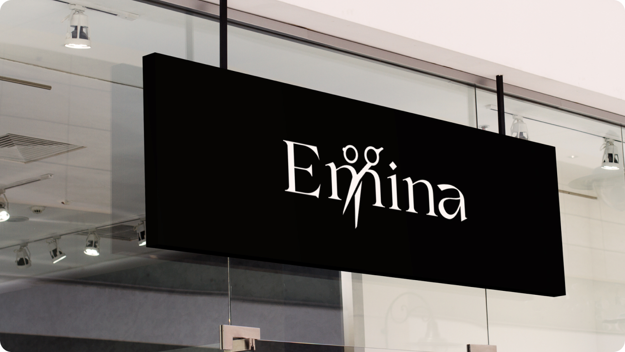
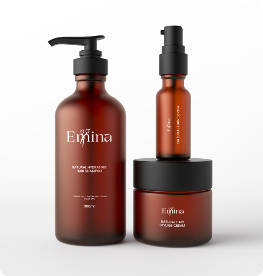
Emina is a family-run salon for men and women, known for combining professional expertise with a warm, welcoming atmosphere. Beyond haircuts, the salon focuses on styling, care, and the use of natural products that protect and nourish hair. Their philosophy is that every visit should leave clients feeling confident, refreshed, and inspired.
Service
Logo Design, Visual Identity
Industry
Hair Salon
Year
2023
Brief
Existing brand of the salon was pretty, but too traditional, passive and easy to blend in. The owner felt that their brand didn’t quite reflect what people felt when visiting. What was missing was a modern identity that would match the salon’s personality: fresh, elegant, and in touch with today’s clients. The project’s focus was uncovering what was already there and giving it a voice.
The Challenge
How do you keep the warmth of a family business while presenting it with the sophistication expected from a premium salon? That was the key question. One pressing obstacle was bridging the comfort of a local salon with a bold visual identity. Many salons lean too decorative or too corporate. Emina needed something that could speak of quality and care without sounding overly impersonal. Another challenge was capturing the essence of their philosophy which is natural products, personal care, and attention to detail.
Our Approach
Every choice was driven by the idea of confidence. We wanted to avoid a generic salon aesthetic, so we looked at what really set Emina apart. Through conversations with the owner and her team, it became clear that hospitality, honesty, and knowledge were their strongest assets. That became our anchor. Instead of following overly decorative salon trends, we kept the design stripped back and modern. We translated those values into guiding principles: keep things simple, keep them modern, and ensure every detail communicates care and trust.
Visual Identity
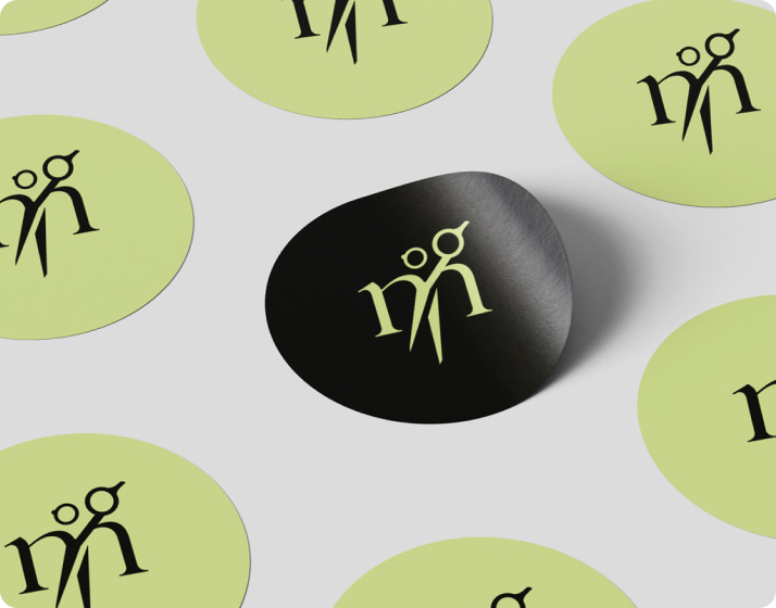
The visual system reflects clarity and sophistication. The lime green instantly signals vitality, while the supporting palette of neutrals gives it balance and structure. Serif typography adds elegance, paired with a sans serif for clean communication. Photography emphasizes authentic salon moments such as the craft of hairstyling, natural textures, and the personal attention clients receive. Together, these elements present Emina as a modern salon with a natural and approachable edge.
Conclusion
The rebrand gave Emina a distinct voice in a market where many salons looked and felt the same. Clients now recognize the salon not only for its service, but for an identity that reflects its honesty, warmth, and professionalism.
For us, this project reinforced an important lesson which is that simplicity has power when it’s rooted in truth. By listening closely to what clients value and care about, we learned that design doesn’t have to shout to be memorable. It just has to be authentic.