Frontrow logo
Back to Projects

Continuum

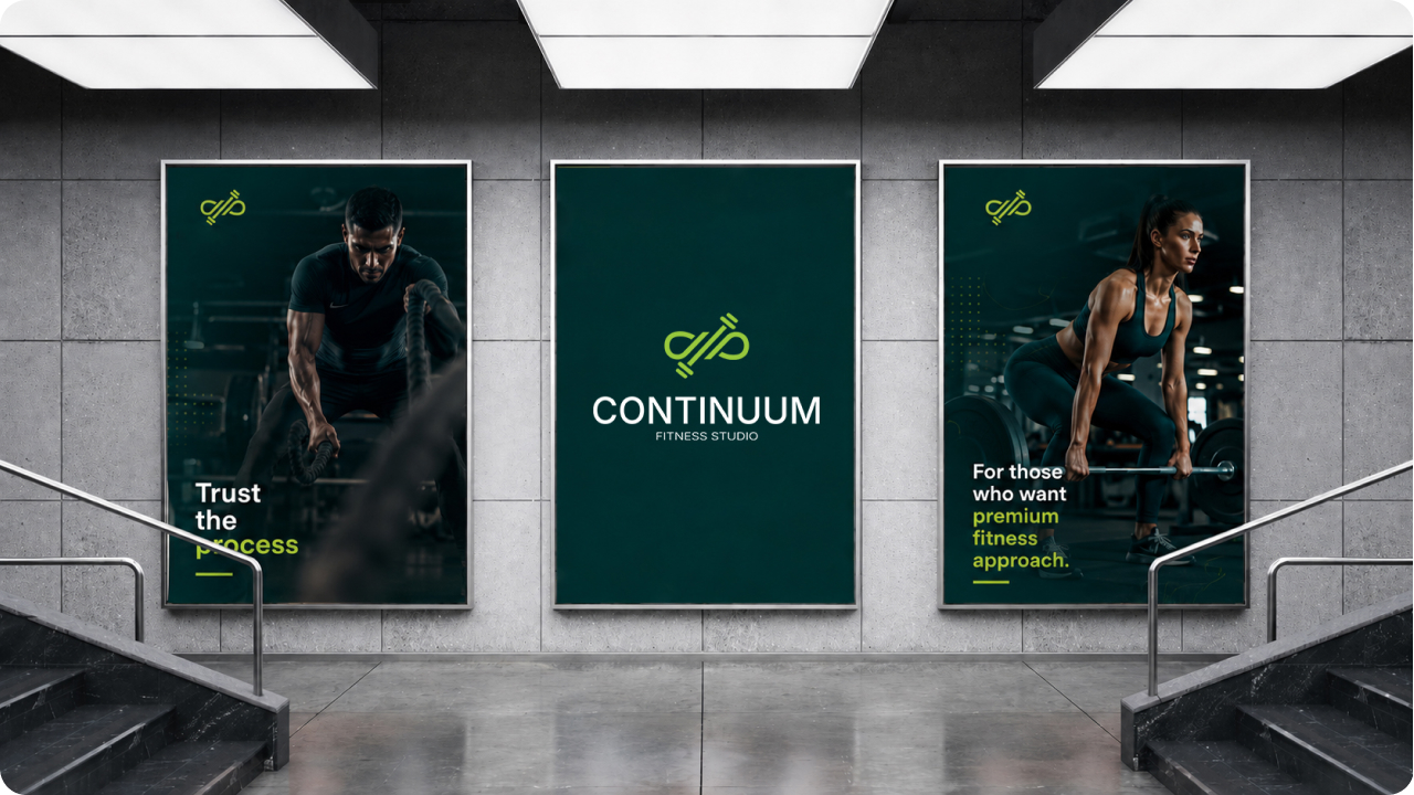
Continuum is a premium fitness studio located in Dedinje, designed for clients who want to escape the crowded atmosphere of typical commercial gyms. Instead of pushing for quick and exhausting results, the studio focuses on building healthy and steady habits in a peaceful and highly organized environment.

Continuum
Service
Logo Design
Industry
Fitness
Year
2026

Brief

The brand name comes from the concept of uninterrupted progression. Design of this logo forms a connection of an infinity symbol with a dumbbell form. It was essential that the overall branding mirror the actual physical studio experience.
The final visual asset had to feel distinct, avoiding generic industry cliches while communicating premium and structured stability.

The Challenge

Most fitness branding relies on aggressive and high contrast visuals, sending a message that is centered around "instant results" or "no pain, no gain."
The challenge was to counter this industry narrative. The visuals and messaging needed to convey stillness, high standards of cleanliness, and psychological comfort. The brand had to communicate that a premium workout space isn’t just defined by its equipment, but by the lack of crowds, the clarity of the environment, and the premium details that foster true focus.
Continuum
Continuum

Our Approach

The story starts with the logo itself, which smoothly connects the infinity loop with a clean dumbbell shape using one continuous line to show steady progress. We wanted to show that Continuum isn’t just a place to quickly show up and check a workout off a list. The design matches the actual look and feel of the studio, using a deep teal and a sharp green accent to create a calm, clean, and organized space.
This clean look ties directly into a straightforward tone of voice. We completely skipped the typical fitness hype and empty promises, keeping the messaging real and direct which speaks to people who are genuinely committed to a lifestyle change.

Conclusion

The final identity sets Continuum apart from standard commercial gyms by focusing on the value rather than short term fitness hype. By aligning the design directly with the calm atmosphere and privacy of the physical studio, the logo naturally appeals to a premium audience. Ultimately, we learned that this approach proves that minimalist restraint can stand out clearly in a noisy market.

Explore Other
Projects

All Projects

Luča

Luča needed a symbol that would instantly feel rooted in Christianity and carry the meaning of light as…

Floxly

The idea behind Floxly was to design a complete digital presence that could convincingly sit in the SaaS…